Google Sheets is one of the most useful applications available on the web that enables users to modify, create, and update spreadsheets and share the data online without any issues. Read this article till the end to learn how to make a graph in google sheets.
Google offers valuable features in spreadsheets like you can add, sort, and delete as many rows as well as columns you want. If you have been actively searching about how to make a graph in google sheets, this article will brief you about the same.
Through Google spreadsheet, multiple users can easily access the sheet irrespective of their geographical location. The collaboration can be done conveniently. If you are facing issues, read below to know how to make a graph in google sheets. The spreadsheets can be uploaded directly from laptops or any other device.
Every change is saved by the applications instantly, and most importantly, it is also visible to the other users. It is very easy to know how to make a graph in google sheets. Google sheets can be modified by multiple users in real-time, and each change is tracked by every user of that sheet.
Here are some of the steps you can follow to make a graph in google sheets:
It is very convenient to create wide ranges of graphs as well as charts in Google sheets, right from some basic lines to bar charts. All can be done very easily. You can also use complexity candlestick as well as radar charts for more advanced presentations.
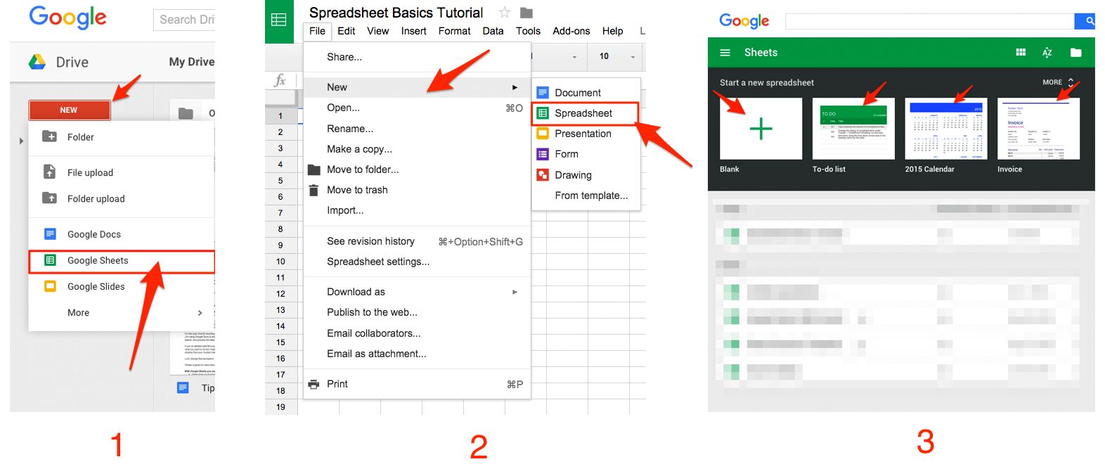
This article will present you with all the information to let you know how to make a graph in google sheets. You can either visit the site https://sheet.new/ for creating a new spreadsheet, or you can also download Google Sheets from the play store.
Some of the steps are detailed below:-
#1. Enter data
Most users enter labels followed by required data in the spreadsheet in columns as well as rows. Usually, the furthest left column and the upper row would label the data properly. Reading this article till the end would serve you every information about how to make a graph in google sheets.

For instance, if you are using Google Spreadsheets for recording sales, you can enter the names of the store in the cells in column A which is along the left, followed by placing the names of the months at the top in row 1. Make sure that you double-check that the data you are using for the chart is up to the mark. However, it is very convenient to learn how to make a graph in google sheets.
#2. Selecting the cells
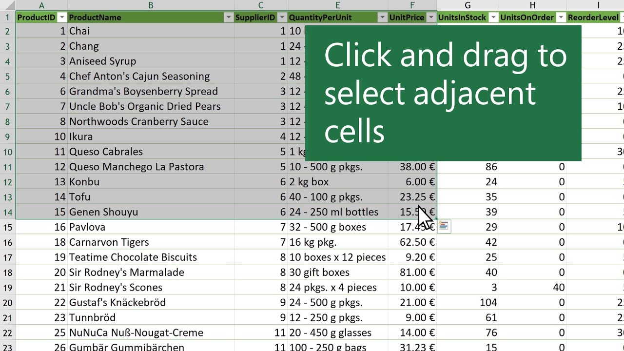
Within your sheet, start selecting the cells that you would require for creating your chart. Usually, you need to select a blank cell at first. The cell is above the labels of the column and those which are left to the rows. It is very convenient to follow these to know how to make a graph in google sheets.

After selecting, you are required to drag the cursor to the below right side of the boundary of the data cells. You can also make a note of the number of rows as well as columns for every cell, and you are free to follow the further step. The users also take note of the upper left as the lower right address to smoother the whole process. You just have to follow this step by step to learn how to make a graph in google sheets.
#3. Choose Insert to select charts

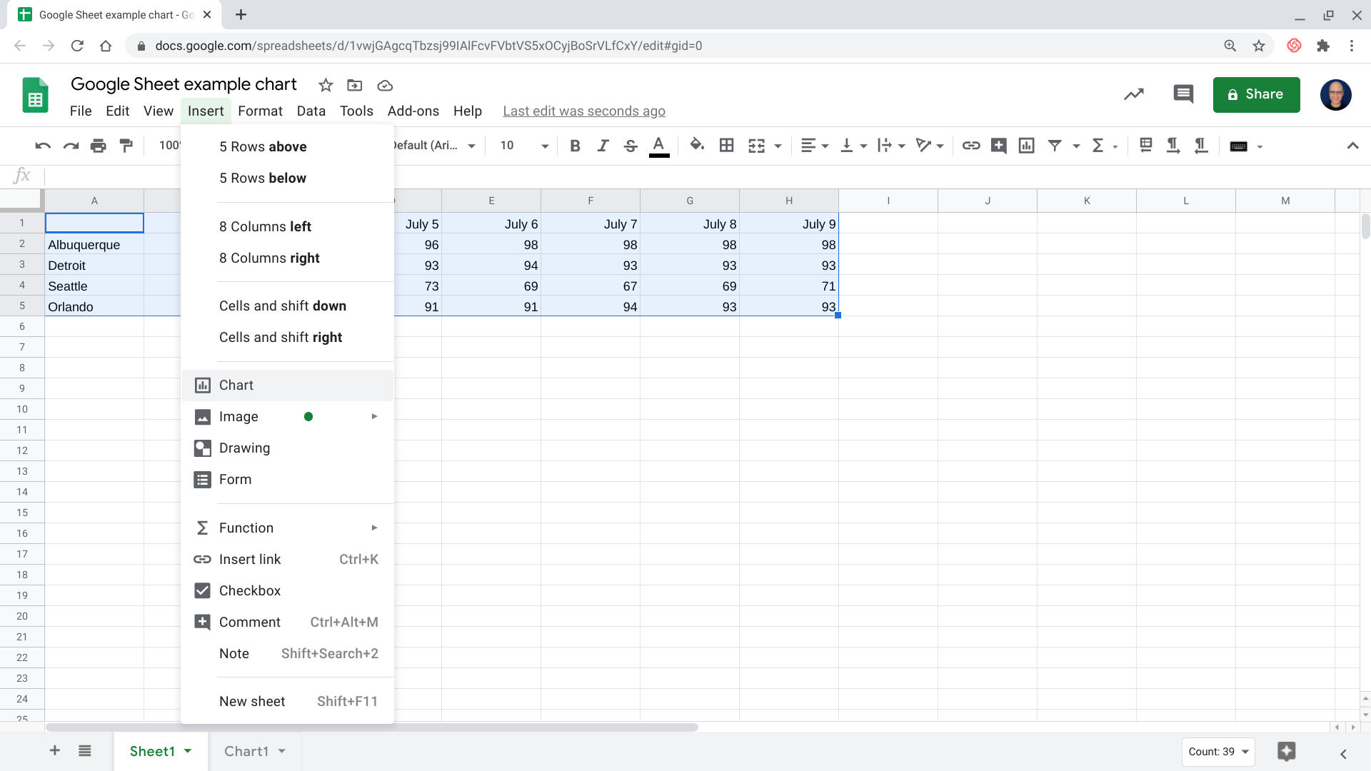
You can either choose insert or chart given in the menu option, which is visible just above the spreadsheet. After you are done with this, a new chart will be created in the Google Sheet, and you are halfway done learning how to make a graph in google sheets.
If you need to keep the chart on the same page, just like the source data, you shouldn’t move the graph to another separate sheet; after selecting the chart, tap ok the three dots which are arranged vertically in the upper right corner of your graph.
You will be able to choose from the menu options, and you can move to your sheet. This step would help you in adding the chart on the sheet which you have selected. Sheets have become such an integral part that it has become important to know how to make a graph in google sheets.
#4. Adjusting the setup
For modifying the appearance of your chart, you need to tap on the edit chart. If your chart and data are on the same sheet, then tap on the three dots, which are vertically arranged in the upper right corner, followed by clicking on the Edit chart.

Source – ZapierAt the right of your chart, the sidebar of the chart editor will be visible to you. Within the sidebar, you can either choose a setup for modifying the settings of the chart data according to your preferences. You can also customize it for adjusting the appearance.
In the Setup, you can easily select the chart type. If you are curious about how to make a graph in google sheets, then this article would help you. Sheets offers you to choose from a wide range of options, including several lines, bars, pie charts, colors, and different types of charts.
#5. Select the chart type
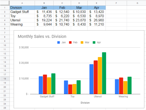
Google Sheets includes a chart-type table that would display the data of the source in a minimal formatted way. For knowing how to make a graph in google sheets, it is essential to select a particular chart type. This would depict not only the data but also the intricate details about it.

Source – Get It AIMost of the users opt for a line chart since it shows all the data which is changed over time. For comparison of different quantities, you can choose bar graphs. Choose pie graphs to get the indication of the total portion.
You can also adjust different colors to make your graph more attractive as well as easier so that it can be understood by most people who might not be able to know the difference with the default color scheme.
#6. Customizing the display
The different options which are available within the personalized section of the chart editor might vary with the type of chart you have selected along with the setting of the setup. You have almost learned all the steps to learn how to make a graph in google sheets after following this.

Source – YagisanatodeWith the chart of the table, limited options are only available. With the help of a line chart, it is convenient for adjusting various kinds of guideline settings, style, legend, axis as well as series. After opening the panel of the chart editor side, you are free to tap on the chart’s element for further modifying the settings.
As per the default settings of the Google Sheet chart, you can create a readable chart. You can also adjust different fonts of the chart’s colors as well as labels since the larger font would make it easier for people to comprehend the data easily.
Is it possible to create a mini graph in a cell?
The users can easily make sparkling, which is regarded as a graph constituting within a cell with the help of Google Sheets. The implementation of Sparklines was done for the indication of the financial data for all the traders.
If you already have learned how to make a graph in google sheets, then applying this would be much easier for you. A sparkling depicts stock price with the help of a time-series graph. Sparklines can easily be created as well as displayed in Google sheets on the web as well as on the apps on all kinds of devices.
Here are some of the steps you can apply for a mini graph:-
- For creating a sparkline, you are required to place the cursor in that cell in which you want the sparkline to be displayed. Tap on entering.
- After that, tap the icon for selecting a range. After the specification of the range, you have to enter a closing parenthesis.
- A function would appear, then click on that.
- The function of the sparklines also extends its support to colors, column charts, custom line settings as well as bars.
- For more assistance, you can take the referral from the help page of the Google Sheets sparkline function.
After completion, users either download or publish their charts. You can easily select the publish chart button being on the chart sheet for making the chart available to all the other users with a link. You can also save the file in PDF form etc.
Frequently Asked Questions (FAQs)
Q1. Is creating a scatter point in Google Sheets easy?
A: Firstly, you are required to tap on the setup, which is there at the chart editor sidebar. Visit the Chart type. After that, the dropdown menu will be visible to you. For conversion of the chart into a scatter plot, you need to select ‘Scatter plot’ by scrolling down the dropdown menu. You will see all the available options under the ‘Suggested’ section. Although it mostly depends on the default analysis of Google’s data.
Q2. What is a multiple-line graph?
A: A multiple line graph is a type of line graph that can be plotted with two or more than two lines. It is primarily used for the depiction of two or more two variables which might vary over the period. The independent variable usually lies on the horizontal axis, and the two or more than that lies on the vertical axis.
Q3. Why do Google sheets fail to graph correctly at times?
A: One of the most common reasons for this issue is that Google Sheets might have added the labels of the data incorrectly to the x-axis. However, it is very easy to correct this common error.
Q4. Is it possible to hide multiple rows on Google Sheets?
A: For hiding multiple rows in Google Spreadsheet, tap on the first row since you have to drag across the rows which you want to hide. You can also press the Shift key and keep holding it till the last row, which you want to hide. After this, press right-clicks for selecting hide rows which also lets you know the number of the rows selected by you.
Q5. Which chart is considered best for comparison?
A: A pie chart is considered to be the best choice for the comparison of values, and bar charts are the common choice for precise comparison. For the comparison of volumes, you can also use a bubble or an area chart. For showcasing trends as well as patterns in the data, you can use a scatter plot, bar chart, and line chart.
Conclusion
Google Sheet makes it quite easy for the users to edit, create as well as format spreadsheets online for organizing as well as analyzing different sorts of information. At the end of this article, you will know everything regarding how to make a graph in google sheets.
Well, knowing the top 15 Content Creators of All Time on YouTube is one of the best feelings. Let’s explore the same.
The comparison of Google Sheet is often made with Microsoft Excel since both of these well-known apps are used for identification purposes. Google Sheets are often referred to as cloud-based Google’s version of Microsoft Excel’s usual features.
The users of Google Sheets are free to enable the data labels and for the display of different numbers in their chart. This article can brief you about how to make a graph in google sheets. Meanwhile, it also enhances the details which are in the chart.
Spreadsheets can be generated by the users for different kinds of charts, graphs, and various other kinds of diagrams that they require. It is very convenient to perform such steps. Every query relating to how to make a graph in google sheets will be resolved.

